Introduction
R is an open source language and environment for statistical computing and graphics. It’s an implementation of the S language which was developed at Bell Laboratories by John Chambers and colleagues. R provides a wide variety of statistical and graphical techniques, including linear and nonlinear modeling, classical statistical tests, time-series analysis, classification, clustering, and others. It is also an interpreted language and can be accessed through a command-line interpreter: For example, if a user types “2+2” at the R command prompt and press enter, the computer replies with “4”. R is freely available under the GNU General Public License.
Plotting The Frequency Distribution
Frequency distribution
A frequency distribution shows the number of occurrences in each category of a categorical variable. For example, in a sample set of users with their favourite colors, we can find out how many users like a specific color.
Data set
Suppose a data set of 30 records including user ID, favorite color and gender:
1 2 3 4 5 6 7 8 9 10 11 12 13 14 15 16 17 18 19 20 21 22 23 24 25 26 27 28 29 30 31 | |
Reading the csv file
Let’s start with reading the csv file:
1
| |
The first argument which is mandatory is the name of file. The second argument indicates whether or not the first row is a set of labels and the third argument indicates the delimiter. The above command will read in the csv file and assign it to a variable called “data”.
You can use the following command to see the list of column names:
1
| |
which results:
1
| |
Or you can use following command to see a summary of the data:
1
| |
1 2 3 4 5 6 7 8 | |
As you see, the number of occurrences of each color is shown in the summary.
Table function
table() uses the cross-classifying factors to build a contingency table of the counts at each combination of factor levels.
1
| |
1 2 | |
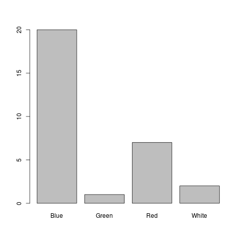
Plotting
Now we can plot it easily using the barplot command:
1
| |
Save the plot as an image
I can see the plot on my machine, but to put it here on my weblog, I have to save it as an image:
1 2 | |
Here you go…
Factor
The factor function is used to create a factor (or category) from a vector.
1
| |
1 2 3 4 | |
Levels is a unique set of values in the vector.
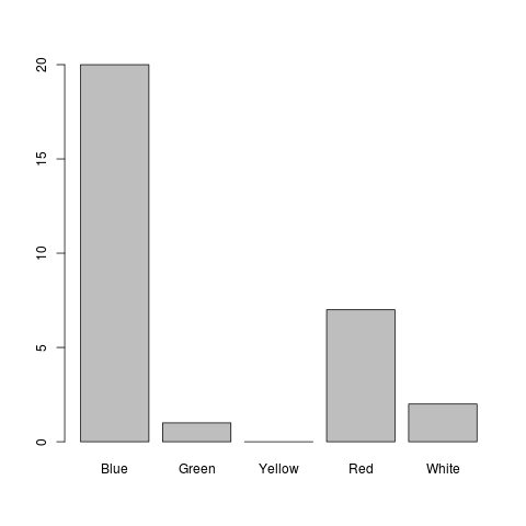
Now, suppose that “Yellow” was also an option for the users but nobody has chosen it as the favourite color. We can use the factor command to customize the categories:
1
| |
1 2 3 4 | |
Now, we can see Yellow in the frequency distribution:
1
| |
1 2 | |
And we can see it on the plot:
1
| |
if you want to see the percentages instead of the values, you can try this:
1 2 | |

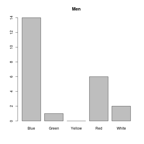
Filtering
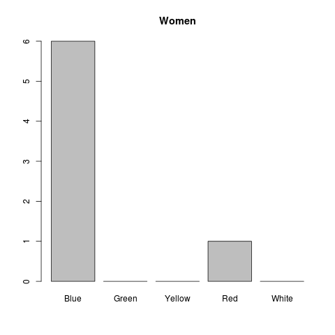
Now, let’s imagine that we want to plot the frequency distribution of favourite colors for men and women separately. The following commands create two subsets of data by filtering the gender and store it to two different variables (Don’t forget the comma!):
1 2 3 | |
now we can plot the distributions seperately:
1 2 3 4 5 | |
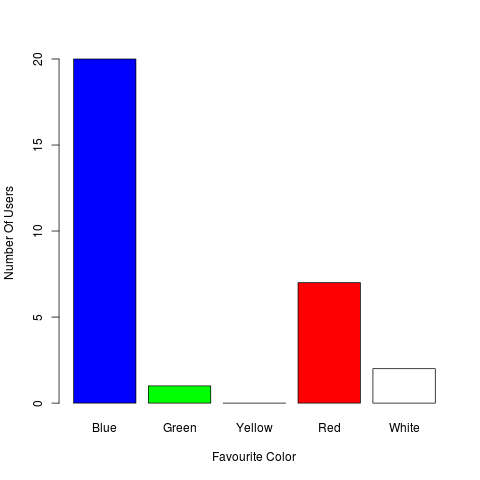
Colors and Labels
Do you like colors and labels?! Here you go…
1 2 3 | |